 |
In young people’s words, Hue Ancient Capital is programmed by "genetic" genes, with beautiful mountains and rivers, a unique ecosystem of architecture, music, and costumes, along with quiet and nostalgic beauty of the Imperial City, at the level of World Heritage sites. In particular, Hue has a special culture in tradition, rituals, lifestyle, and a special culinary system.
Accordingly, the three keywords about lifestyle are traditional family, traditional art, and traditional cuisine; all are traditional. This group of young Gen Z people also pick out three keywords about the character of the people of Hue, which are proud, gentle, artistic, and sophisticated.
From a design perspective, we believe that this is the DNA of Hue tourist city, which is beautiful, poetic, dreamy, quiet, and silent. A diverse and unique tourism experience in Hue must contains these concepts. And my students and I look for ideas and images to explain the sophistication and mystery, and therefore, the charm of the Ancient Capital.
 |
You may love Hue even more, after a visual journey to this place, through the logos and posters of Duy Tan University graphic design students, and I, who graded their work yesterday, will now be your tour guide.
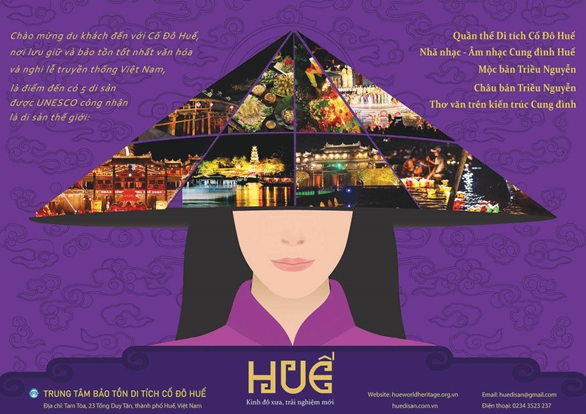
The poster themed "Hue - Ancient Capital, New Experiences" by Nguyen Thanh Phuc. This young boy from Phong Dien has created the concept of the poem conical hat of today - a combination of images of Hue's cultural festival - young, new, and strange.
Logos of two students, Phan Le Binh Nguyen and Tran Ngoc Quynh Thy. The logo of Huong Hue Tourism Company by Binh Nguyen: The image of the Muse of the Huong River and Mount Ngu blends in with a nostalgic background, depicting a Hue scene that is "gentle and pensive". This is perhaps the first time in the logo that the Truong Tien Bridge is depicted in lotus pink, blending in with the purple Mount Ngu Binh.
People often know that "House" is a structure to live in, "Home" is a happy house to live in, "Home sweet home" is a happy home, "Homestay" - staying with the host family. And Quynh Thy - a girl from Da Nang who has just known Hue for 24 hours - has mixed the feeling of happiness when returning home with the experience of a warm and relaxing homestay, like in a happy home. That is Home sweet homestay. The naive and innocent drawing style has increased the feeling of intimacy.
 |
| Three logo designs imbued with Hue culture by Duy Tan University students |
How are cyclo riders in Hue different from the ones in other places? - They understand and love Hue, and everyone can be a volunteer tour guide! This love and faith helped Phan Van Duong, a young boy from Hue, create a simple and reliable logo for Hue tourist cyclo. Similarly, fellow countryman Phan Xuan Du has logoized the Cam Hue Beef Noodle logo with a nostalgic color. Nguyen Ngoc Tuan Anh has created a new agarwood bud for Thuy Xuan village. Nguyen Thien Nga has both swirled and spread the fragrance of flowers for Huong Tra flower shop. They bring a fresh and contemporary look.
Visiting the Thien An bookstore - logo by Nguyen Thuy Linh. You can see the simple arrangement and blending of the great ideas of life: book pages, seagulls, waves, and the horizon. The sea of knowledge opens the eyes and the horizon. The kite flying hobby of the locals in the Ancient Capital is simplified by Le Minh Quan with one stroke: a kite flying in the wind, flying higher than the clouds.
Once again, Thanh Phuc, through the poster themed "Let’s go to Hue Ancient Capital", has inspired visitors to stay up late with the city that goes to sleep early, to learn more about Hue, starting from the mysterious dreamy night...
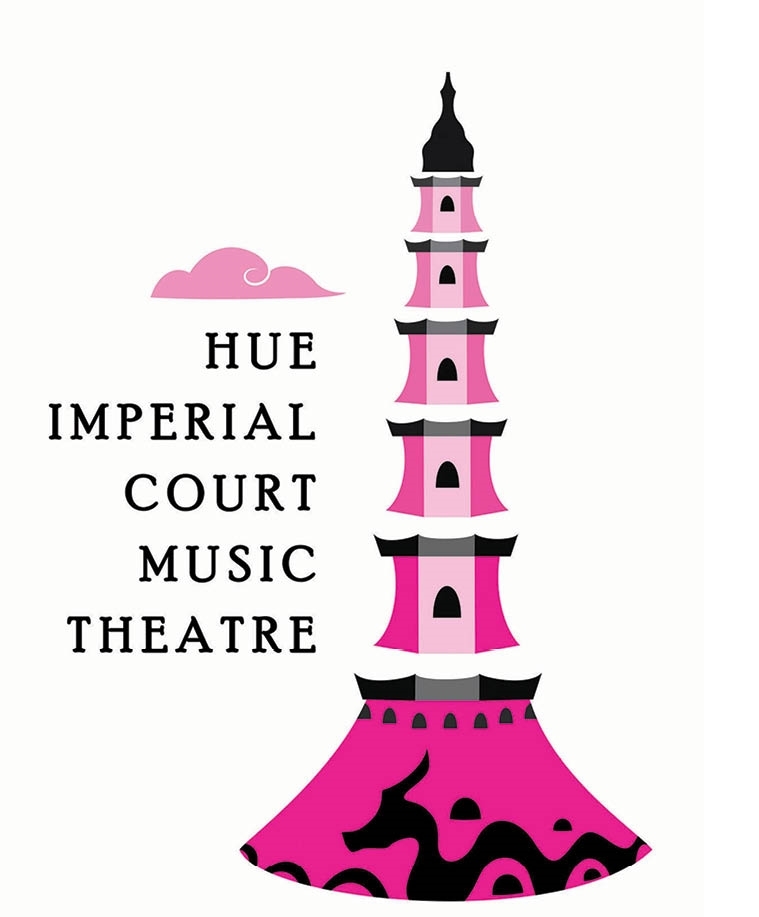
Ha Phuong Thanh, a young girl from Nghe An, must have fallen in love with Hue through the logo of the Hue Royal Court Music Theater, when she brought an impressive look: the harmony of the ken bau (a musical instrument), a soul in the court music ensemble, with the image of Phuoc Duyen tower of Thien Mu pagoda. It is strange that this classy and artistic design is her first design.
After visiting the pagoda, let's go to the beauty salon. With a minimalist style, Nguyen Thi Hoang Yen has created a logo for the beauty care service that is bright and elegant through the image of a gracefully tied hair, signaling the reliable quality of Huong Spa.
In a different way, Nguyen Ha Tu Uyen designed a logo for her mother's long-standing Cam Tu ao dai shop. A stylized elegant Hue girl in a lotus flower, the purple color of Hue blends with the pink lotus color, which is passionate but pure.
Going hiking with his friends since childhood, Phan Anh Tuan, a young boy living at the foot of Mount Bach Ma in Nam Dong district, chose Bach Ma as a natural choice when choosing a theme for his tourism poster. Being clear and concise, the impression of "the call of the wild" can be "heard" from the majestic and magnificent landscape of Thua Thien.
Dao Thi Ngoc Huyen designed a logo for the Suoi Mo camping service even though she had never been there. Dreamy, clear, blue, and murmuring are the keywords of this logo. "You “give” me the chance to be on the newspaper, then, I will go to Suoi Mo immediately!," chatted the dynamic girl from Pleiku.
Most visitors check in at the Lang Co scenery at noon. But for Vu Le Gia Bao (Lang Co travel logo) and the locals, her hometown Lap An lagoon is most beautiful at sunset. That was the detail she defended to the end in an online grading session, lasting from evening till 2 a.m. "My mother just smiled, while my younger sister said it was beautiful. She will study design with me! When you check in at the Hai Van pass by motorbike, remember to let me know, I will run to the foot of the pass to welcome you!"
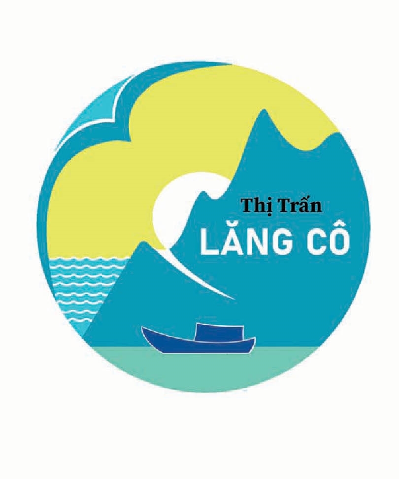
From Gia Bao's Lap An lagoon scene, just turn left to see Lang Co Bay and the foot of Hai Van Pass. That is the scene in the logo of Lang Co town by Pham Nguyen Khang, Gia Bao's fellow countryman - a logo depicting a peaceful and bright town. Ten days ago, from the top of the pass hiding from the rain, when riding a motorbike back from Da Nang, Khang sent me a video, "Here is Lang Co, teacher!". After finishing the logo, I love my hometown more!
In logo design for the tourism sector, many people have drawn suitcases, or described Hue in a realistic way. But Ho Thi Thu Thao is definitely the first person to put a suitcase with a general image of Hue Ancient Capital, with its beautiful scenery and nostalgic atmosphere. For visitors who are about to come to Hue, the image on the suitcase is like an image of anticipation - coming to Hue. For the ones who are leaving Hue, it is an unforgettable impression - bring Hue along. That is her philosophy about the imaginary brand of Hue Tourism. If people are used to seeing purple, which is the purple color of Hue, Hue lovers can now get used to this color palette by Thu Thao, a young girl from Binh Dinh - it is the orange color of Hue.
I have a constant happiness: being a witness in the garden of creative ideas, and accompanying dozens of new ideas every day. The designs that you see on this page are the works that are effectively supported by the latest artificial intelligence (AI) technology, which we apply directly to this subject for the first time.
A journey to the Ancient Capital through the logos by graphic design students, with imaginary brands, is an example. It is also a mini creative journey about Hue tourism, along with the hope that Hue tourism will be more creative.
Hue Ancient Capital is an extraordinary land of mountains and rivers. This feeling is true for those who have Hue in their hearts, whether they are deeply attached or distant. But for many people who have never set foot here, this land seems like a space, a magnetic field that has fascinated visitors for a long time. It will surely last forever!
